The Earth isn’t flat—our media shouldn’t be, either! Communications tools are emerging that allow our media to match the richness and depth of the real world. We call this array of immersive technologies extended reality (XR), encompassing virtual reality (VR) and augmented reality (AR). And they promise to bring new dimensions to the way we connect and communicate with each other, just as mobile and web technologies did over the past decades. Before, your message was expected to fit within a palm-sized phone. Soon, we’ll be creating stories that inhabit entire rooms, blocks, or worlds.
This transformation to media in 3D—also called spatial computing—has inspired us to create Agog, a new institute that helps people harness the power of XR to create human connection, cultivate empathy, and inspire action toward a more just and sustainable future. The spatial wave is coming faster than most realize—Apple and others are notably enhancing support for XR experiences on the web—and we want all organizations and groups, not just the largest and mightiest, to be able to ride it to achieve their goals.
Agog is committed to making XR skills and technologies more accessible because we recognize the distinct challenges of designing for 3D, in addition to the opportunities afforded by this shift in communications. As an organization, we’ll share real-time learnings, starting with this guide to creating an XR-ready brand. We draw from Agog’s own journey, including the support we received from our agency partners Upstatement and 14islands. Read on for insights and best practices, as well as practical tips on how to create a spatial, 3D brand.
Whatever your background—whether you are a creator, storyteller, designer, developer, or simply an inquisitive soul—we invite you to discover more about this new era in storytelling. Newcomers to XR will walk away with some foundational knowledge from this guide, and more experienced users can expect to find fresh tools and techniques.

Overview
Quickstart guide to 3D brands
Even as XR is advancing quickly, few current examples of XR-ready brands exist and even fewer resources are available on how to develop one. To help those curious about spatial brands—or those who just want to know what the heck a spatial brand even is—we’ve put together an overview of key insights we’ve gleaned in the process of creating such a brand.
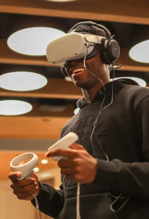
- Learn the language of spatial: XR (aka, immersive media; aka, spatial computing) refers to technologies, such as VR headsets, that work with your senses to make you feel as if you are truly experiencing, in a visceral, full-body way, what you are actually encountering through a series of screens and/or haptic feedback. See “What is immersive media?”
- Define the potential of XR for your organization: Determine how immersive technologies can uniquely engage your audience. If XR offers exciting new possibilities and you aim to deliver 3D experiences, a spatial brand may be right for your organization. See “Delving into spatial branding” for more detail.
- Collaborate with the right partners: Whether building an internal team or external partnership, look for collaborators with strong branding and technology chops. If you are a designer or developer, make sure to acquire the basics of XR design and development before scoping your organization’s, or your client’s, project. See “Choosing the right partners.”
- Design brand assets with all angles in mind: As you transform brand assets, such as logos, into 3D objects, make sure they are interesting to look at from all points of view. Explore physical properties as meticulously as colors. Define interactions, motion, and sound so your brand feels immersive and emotionally engaging to audiences. See “Spatial-first brand systems.”
- Explore WebXR for spatial websites: WebXR enables 3D experiences directly through standard websites without the need for a separate app. Encourage your users to try out XR by adopting progressive enhancement strategies to deliver XR content across different devices and make your XR experience accessible from your 2D website. See “Creating a spatial-forward website.”
- Select the right toolset and tech stack: This one’s for the nerds. Choose tools based on project complexity and accessibility. Prioritize lightweight libraries like Three.js or Babylon.js for simple XR experiences and use a design toolset that feels familiar with your existing workflow. See “Our technology stack.”
- Design for interaction and accessibility: Ensure that spatial brand elements are interactive and functional. Consider user ergonomics, movements, and device capabilities for a seamless experience. Test interactions early and iterate based on feedback to enhance accessibility. See “XR user interactivity and accessibility tips.”
- Keep performance in mind: Make 3D models simple to reduce rendering costs and optimize performance. Use physically based rendering (PBR) materials for realism and adjust textures for XR headsets. Enhance lighting with image-based lighting (IBL) techniques. Test typography for legibility in XR environments, avoiding thin or condensed fonts. See “WebXR Dos and Don’ts.”
Want to know more? Continue to read the full story.
The Challenge
Branding a new kind of institute
Design-wise, there are pros and cons to starting a new organization. Pros: In our case, we didn’t have collateral to refresh or a website to overhaul. We had a sparkling-clean record and an enthusiastic team. Yay! Cons? No one knew who we were—and squat about our mission. So our brand would have to say a lot and do even more.
Agog believes that spatial websites and XR experiences are on the verge of becoming mainstream. We are noticing broader adoption of standards, including by Apple, which recently announced default support for WebXR on Safari for Vision Pro. Technological changes on this scale, while exciting, create new design challenges. Just as the growing use of smartphones forced design to evolve toward mobile-first, the new spatial wave will require brands to get comfy in 3D.
For us, creating a spatial brand would be an important demonstration of our belief in XR and its potential to spur positive change. Immersive media allows people to experience new worlds, cultivating a profound sense of reality and empathy. We needed to bring that idea to life—and with any luck, leave some folks genuinely agog.
Delving into spatial branding
While traditional brands are created to exist primarily on 2D websites and smartphones, as well as on printed materials, Agog needed a visual identity that could progressively adapt to the current and future capabilities of AR and VR, in addition to the myriad existing hardware devices, never mind future ones. Spatial brands, and immersive experiences more generally, represent a big shift because they change the focus from how organizations appear to how they make people feel. A spatial brand would empower Agog to craft engaging and memorable immersive experiences, from online events to educational content.
🔎 Spatial brand systems are designed to thrive in three-dimensional, interactive environments. They prioritize audience immersion, including logos that are represented as 3D objects with which users can engage. Similar to interactive exhibitions or cinematic experiences, spatial brands prompt designers to consider sound, materials, lighting, and movement. By experiencing a brand in XR, users feel a sense of reality, shared presence, and stronger emotional connections.
Currently, only a handful of organizations have intentionally developed spatial brands. The best known example is Meta’s continuous loop symbol, launched in 2021, which was created to be experienced from different perspectives.

“The Meta symbol was designed to dynamically live in the metaverse—where you can move through it and around it. It can take on infinite textures, colors and movement, capturing the creativity and imagination of a 3D world.”
Source: design.facebook.com
Pluto VR—founded by Agog advisors Jared Cheshier and John Vechey—launched its spatial brand in 2020. Built using progressive enhancement principles, its website dynamically adapts to the device on which it is viewed. Regular (old-school) screens show 2D designs, while XR-enabled devices reveal 3D objects almost magically.
🔎 Progressive enhancement is the strategy of building websites in layers, starting with basic features that work on all devices. As users equipped with more advanced technology access the site, additional enhancements are added to provide a richer experience. This approach ensures accessibility, performance, and compatibility across different devices and browsers.
Because so few organizations have developed for XR thus far, the industry lacks spatial brand resources and examples. With no blueprint for spatial brand development, we needed to find our own path forward.
Choosing the right partners
You’ll be hard-pressed to find agencies that specialize in spatial brand development. Like we said, this is new territory. To meet our brand requirements—and fill up our Time Zone Bingo card—we Pacific Timers at Agog selected two partners for a unique, multi-disciplinary collaboration: Upstatement, a digital branding studio based in Boston, and 14islands, a Swedish creative studio with spatial computing and XR expertise.
Upstatement managed the overall brand strategy, design direction, and website implementation, while 14islands served as spatial advisors and developed our XR web layer. In addition to creating a cohesive brand and website, our goal was to share learnings across the team and pilot a successful collaboration. This method of partnership was crucial to achieving the emotional, aesthetic, and practical goals of our brand.
The Approach
Defining our spatial brand system
Traditional brand systems cover visual and verbal elements, such as logos, typography, color palettes, imagery guidelines, and voice recommendations. For our spatial brand system, we needed to think about factors similar to those of real-world objects, like interiors and interactive exhibitions, while also addressing technical limitations, like performance and resolution. Our spatial brand system included the following:
Logo
Just like a 2D logo, a spatial logo serves as the first impression of a brand, designed to spark recognition and a connection to organizational values. Spatial logos are 3D objects that you can manipulate and view from different angles in AR and VR environments. They might feel like a real object or a piece of art, like a sculpture. Designers have to embrace the element of unpredictability, knowing people will encounter your logo from unexpected angles or from the back. The challenge is to create geometries that remain engaging from all perspectives—sometimes even containing surprises.
Especially given our mission, which is conveyed by the word agog, we wanted our logo to evoke feelings of possibility in both 2D and 3D—to be able to transition from 2D, “flat” representations to spatial, depending on the device. A conventional logo would not be enough.
Materials
Beyond color and type, spatial brand systems also need to consider materials. Physical surfaces are rich and complicated. Every surface has a material, a texture, and varying levels of light reflection. No object is perfectly white or entirely black. Similarly, we found that nothing about selecting materials was a straightforward black-or-white choice. It was important to carefully consider the physical properties of the designed objects. Let’s just say that, for us, surface “shininess” was the subject of some debate. Materials and lighting hold as much significance for spatial brands and environments as brand colors do for traditional brand elements. Agog had to give serious thought to the kinds of worlds that we wanted to build in XR—the spaces in which our logo would show up—and how our adopted materials would fit into those worlds.
Motion
Spatial brand systems also account for motion, which helps get across a brand’s personality and ensures consistency across experiences. Motion also contributes to the physical properties of objects within a scene, conveying a sense of weight and density even without tactile feedback (though XR is increasingly incorporating haptic responses). Exploring this perspective was fun! How might users react if they saw a heavy rock floating like a feather? How would the movement of objects enhance the fullness of the experience? What would the Agog logo move like?
Sound
In 2D, web and social media users don’t mind reading and often disable sounds. XR, on the other hand, creates opportunities for a richer experience that users won’t want to dial down, such as narration or ambient music to deepen immersion and emotional connection. Similar to motion design, sound design provides users with immediate feedback to their actions, guiding them through experiences and enhancing the sense of reality. Would Agog sound mechanical, organic, or squishy? And how would those sounds complement the other elements of the brand?
Collaborating on design and development
Orientation and research
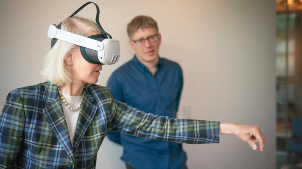
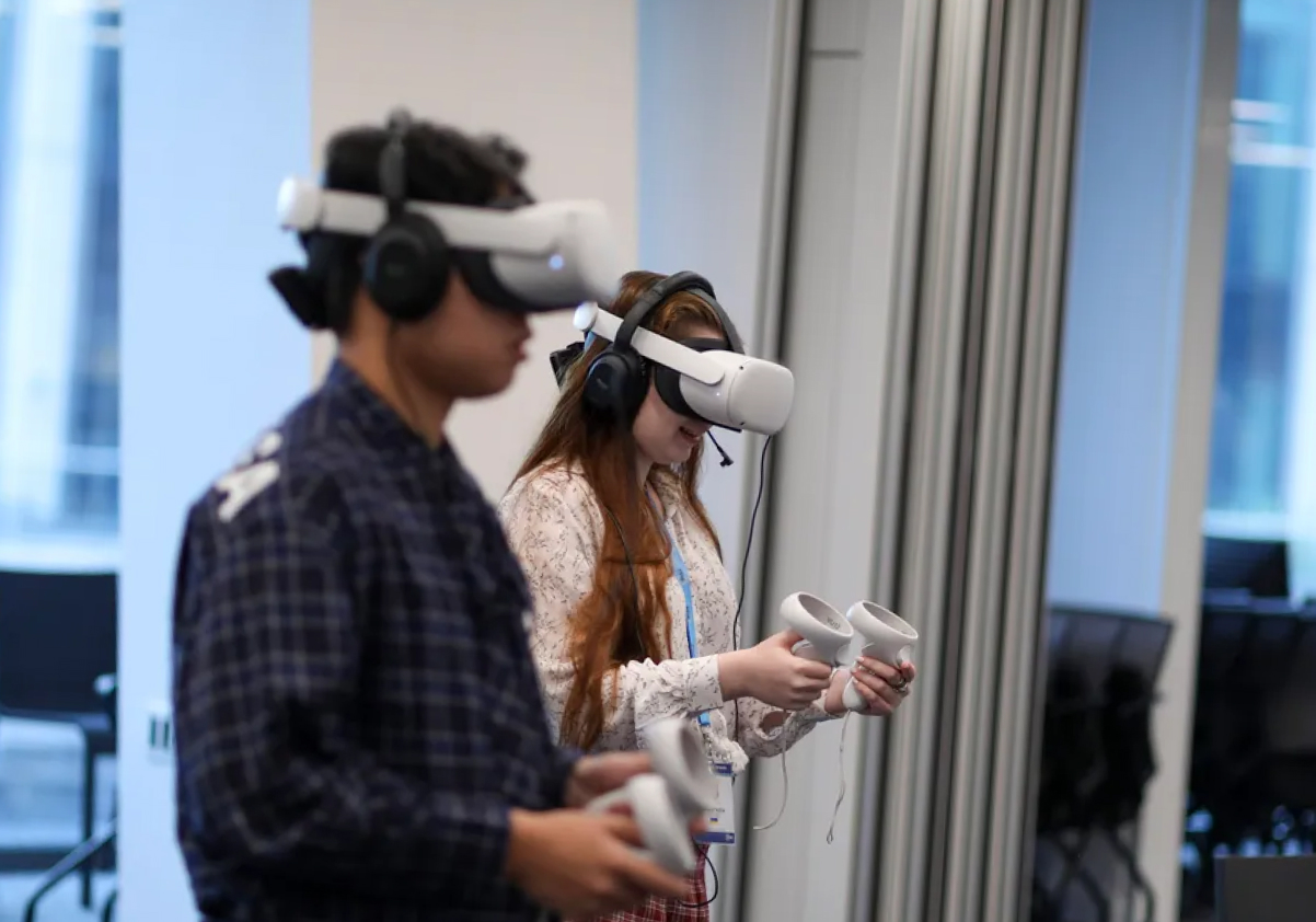
As with a traditional branding project, we conducted a strategy workshop and stakeholder interviews. In the process, we honed our vision of what we wanted Agog’s brand to communicate and aligned on our team’s objectives. To accommodate those new to XR—not all of us on the team were experts—it was important to allocate time early in the project to try out a range of experiences together in VR headsets. Even experienced team members needed to catch up with the evolving technology. Sharing a learning session in social VR helped provide additional context on the field in which we operate. But, really, nothing brings disparate teams together like a VR mini-golf sesh!
Concept phase
Our team drew inspiration from real-life objects and environments to translate Agog’s vision of a better tomorrow, and the wonder and awe associated with that vision, into a visual identity. We explored different logos, shapes, materials, sounds, and emotions. What makes a specific object memorable? And how would a person want to interact with it?

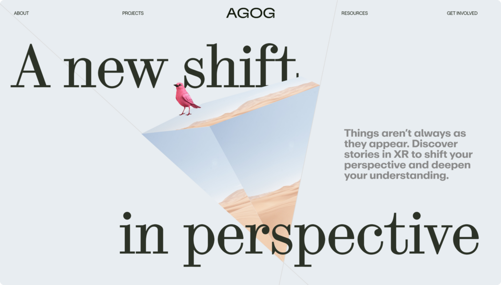
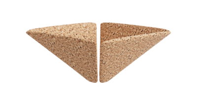
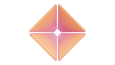
Mirrors, pyramids, ribbons, ethereal interiors, and the early 1990s web all served as starting points for different concepts. We merged these ideas with an “impossible moment”—a portal into new worlds that couldn’t exist in real life. This fusion of the familiar and surreal became the basis for our immersive storytelling pathway.
We continued to experiment with a pyramidal object that intrigued the whole team, but was also giving Dan Brown-novel Masonic temple vibes. We inverted and abstracted it, ultimately landing on an approachable yet tech-inspired flower, which started to form the foundation for Agog’s shape language that would complement our logo.
Design toolset
Ready to go deeper on how we did it? Then read on! (But we won’t judge if you skip ahead to The Outcome.)
Most digital agencies, designers, and developers have their own set of tools and may hesitate to invest heavily in learning new ones until XR becomes central to their work. To design the Agog brand, website, and WebXR experience, we prioritized tools that were already familiar or easy to pick up for digital designers. For XR design specifically, we used Spline and Bezi. When combined, they sound like a show on Nickelodeon, but they are in fact incredibly helpful prototyping tools.
Although these tools don’t replace 3D software for detailed modeling and texturing, they significantly speed up scene prototyping in low-poly resolution using real-time rendering, providing a realistic impression of what can be achieved with WebXR.
Spline is a WebGL-based tool that allows users to prototype interactive 3D scenes without advanced knowledge in 3D modeling. Spline recently introduced an “export to visionOS” function, enabling users to test scenes on an Apple Vision Pro, though the tool currently doesn’t support other company’s headsets.
Bezi is similar to Spline, but with a stronger focus on AR and VR design. With its XR Human Body Rig, all scenes can easily be tested with most headsets now on the market.


Creating a spatial-forward website
Unsure how to access any XR content to begin with? Unfortunately, you’re not alone. Depending on the content, you often need a specific XR headset to experience the content and also must locate, download, and install just the right app to do so. Agog wanted to create an XR experience with as few barriers as possible—ideally requiring no headset at all!
Our technology stack
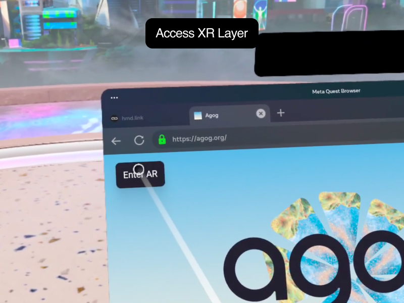
We decided to explore WebXR, an exciting developing technology that enables standard websites to share XR content directly without need for separate installations or downloads. WebXR empowered us to adopt a strategy of progressive enhancement to deliver XR content through Agog’s website, whether you visit it via a laptop computer, tablet, phone, or an XR-devoted headset. Visitors with XR-capable devices are prompted to activate an immersive XR layer.
🔎 WebXR allows users to access immersive experiences directly through web browsers. At its core, WebXR leverages cutting-edge APIs to seamlessly integrate VR and AR capabilities into web applications, using the power of WebGL for rendering and JavaScript for interactivity. The development of WebXR was a collaborative effort to help democratize immersive technologies and make them more accessible to a broader audience, marking a new era of interactive and immersive web experiences.
Picking your technology stack—the right combination of tech solutions to create your experience—depends on factors such as licensing, the complexity of the experience, and its accessibility.
Reducing your website’s footprint (i.e., the amount of data required to load your website) is the best way to optimize the user experience. Agog’s WebXR layer was built using Three.js and the React XR library, which helped keep the code relatively lightweight. A setup like ours could also be created directly with a JavaScript library such as Babylon.js which, like Three.js, offers robust WebXR support.
Cross-disciplinary collaboration
Once the brand concept was established, our designers and developers found it convenient to collaborate directly in WebXR to design final materials, lighting, and colors in code. Design phases transitioned into prototyping phases to test and adapt the experience. The team used CodeSandbox to share prototypes easily with debug panels, iterate on ideas, and allow designers to tweak the look of the XR scenes. Once prototypes were solid, we lifted them into the main codebase for finalization.
For more details, you can refer to our “Dos and Don’ts in WebXR.“
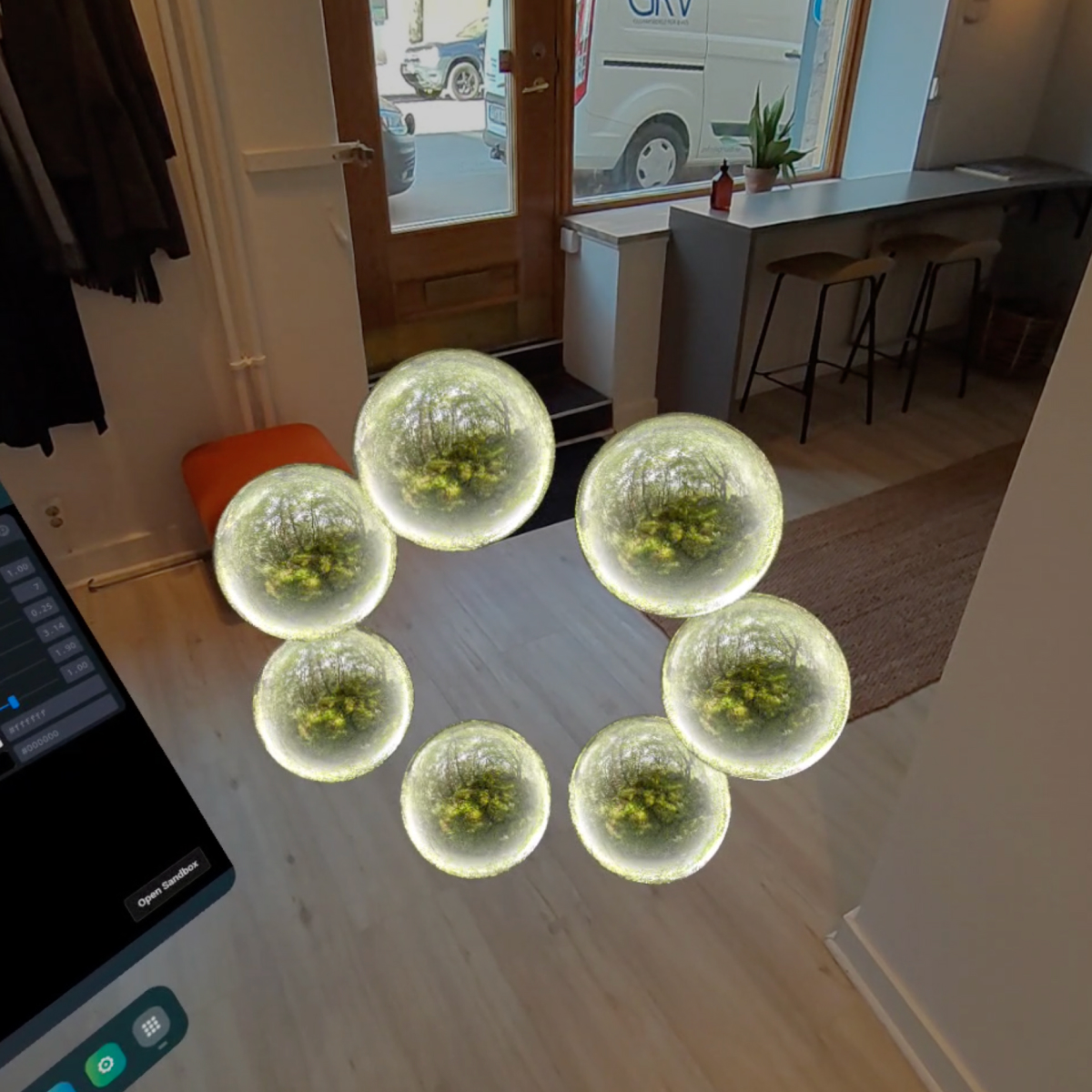
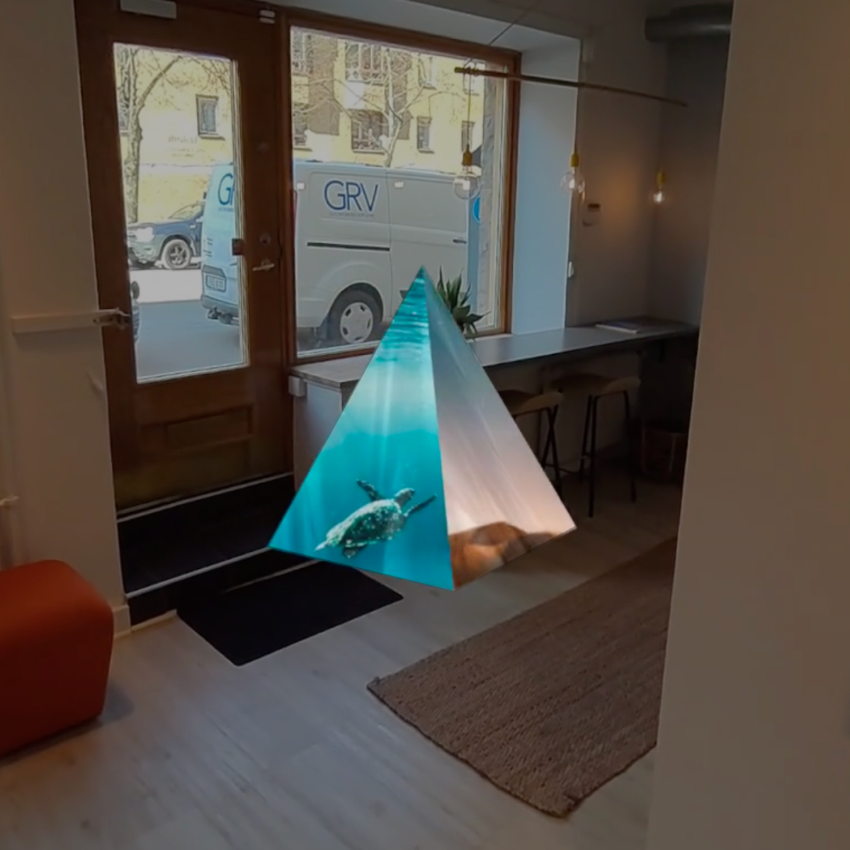
Try these WebXR prototypes with a WebXR-supported device. If you have a headset, you can use hmd.link or the Meta Quest app to copy the relevant link directly into your device.
The Outcome
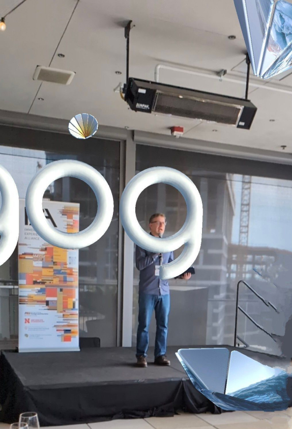
On the day of our public launch, the Agog team gathered in March in Austin, Texas, for South by Southwest 2024, whose participants included key audiences for our work, as well as many potential collaborators. Debuting with an innovative, 3D brand that prioritized spatial design and technologies helped us strike the right tone as a new organization in the immersive media space—even evoking oohs and ahhs from some of the brightest lights in the field. Our new visual identity progressively adapts to all media types, whether viewed on a printed poster, laptop, or AR/VR device.
At launch, our website featured a WebXR experience, allowing users with XR-ready devices to explore Agog’s vision in 3D, whether through VR or AR. Although this initial version served more as a showcase than as an expansive spatial website, the experience especially sparked excitement among web visitors as they discovered the AR experience on their Android phones. Shortly after launch, we were thrilled by Apple’s WWDC announcement that it would shortly begin to support WebXR on visionOS and macOS devices.
Introducing Agog’s new spatial brand
Logo
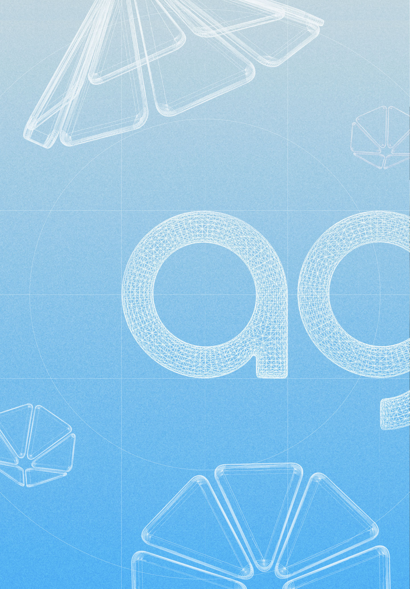
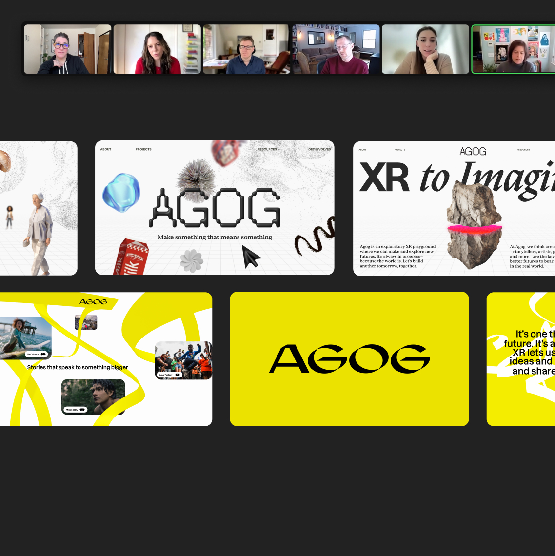
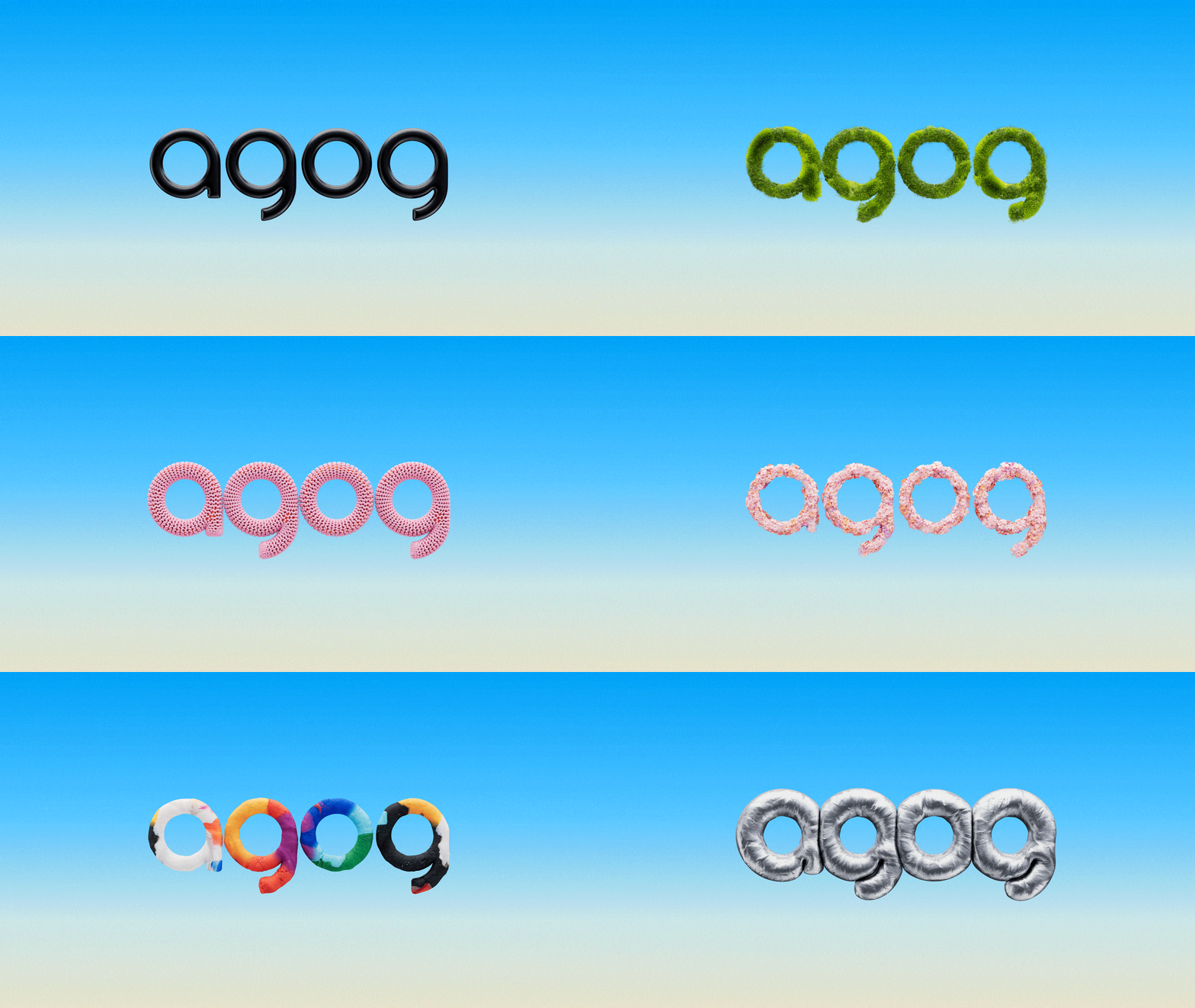
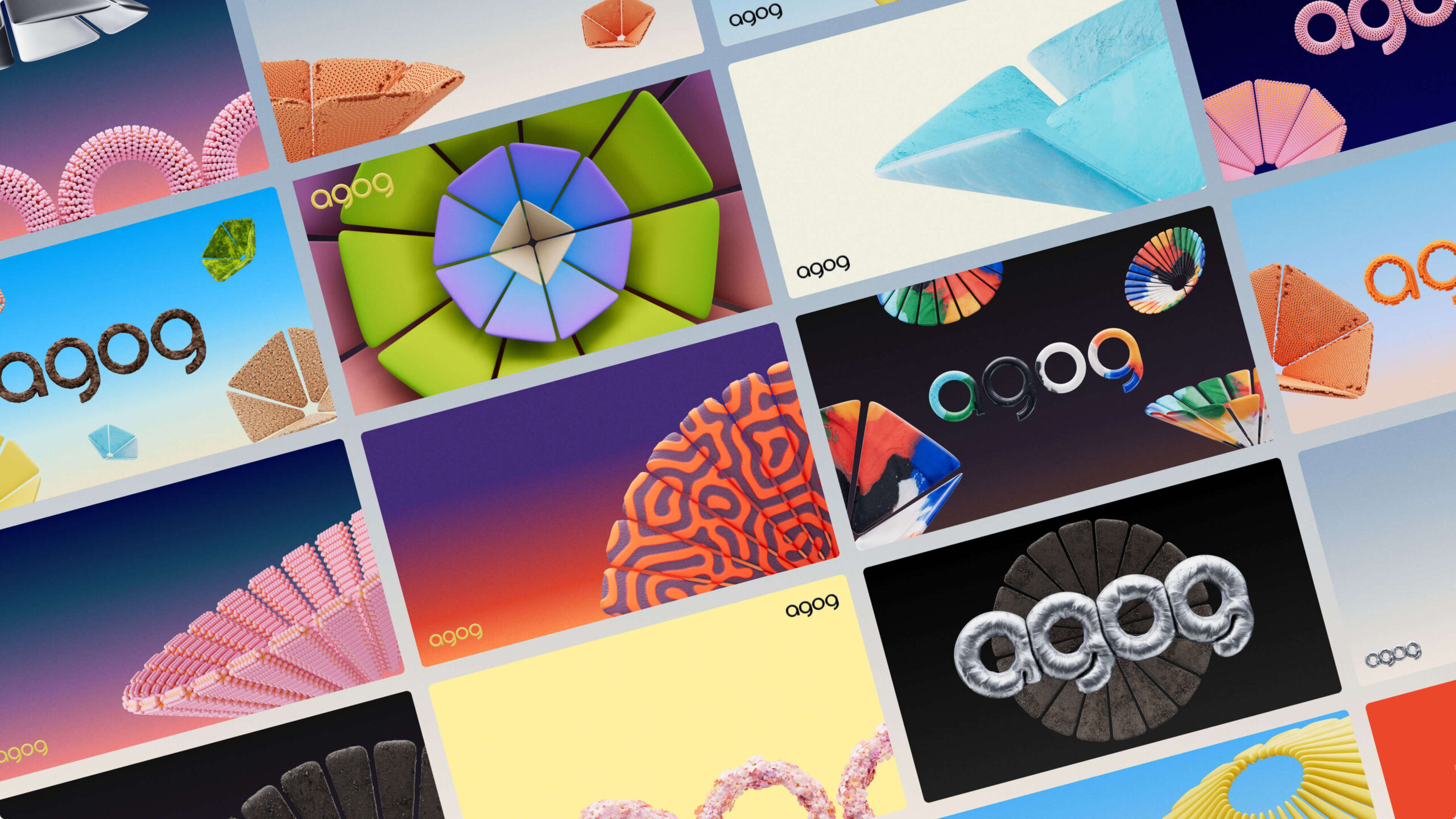
The Agog logo is a custom wordmark created with rounded letterforms to evoke a feeling of welcoming and open possibilities. It is inspired by goggles and portholes through which to view the world around us, gateways to connect with each other and new experiences, and mirrors that reflect back our inner selves. If Agog’s essence is rooted in human connection, its activation lies in taking people into new realities.
The Agog logo is created to work well in 2D and 3D, painted in diverse, nature-inspired materials. It also rearranges itself in 3D to form an askew version. This intentionally playful arrangement shifts each letter into a different position and rotation in space. Mostly used in interactions, it invites audiences to shift perspectives and explore beyond the 2D canvas.
Shape language
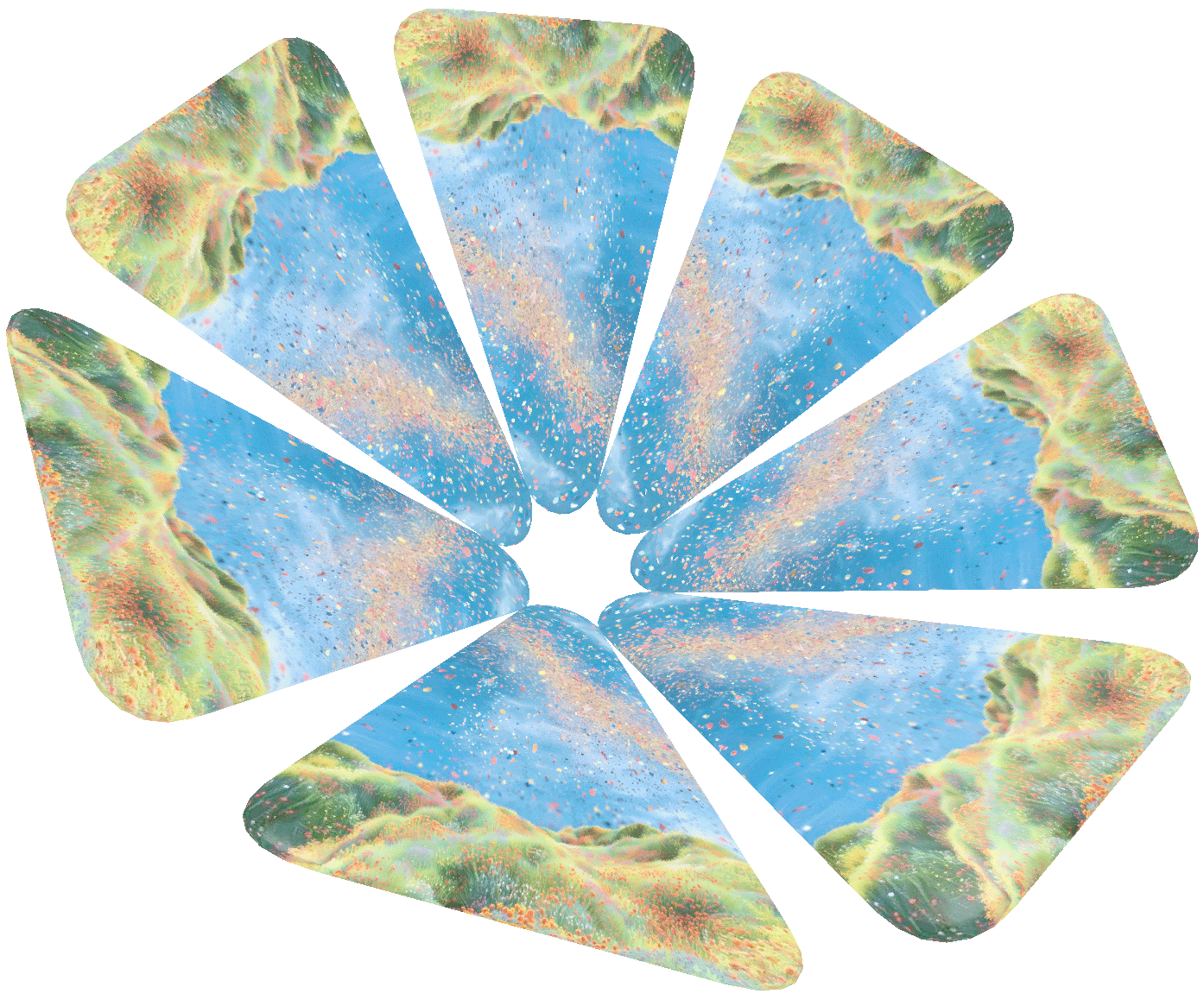
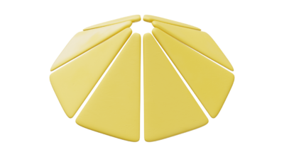
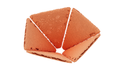
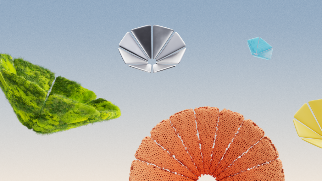
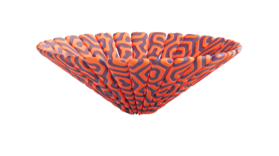
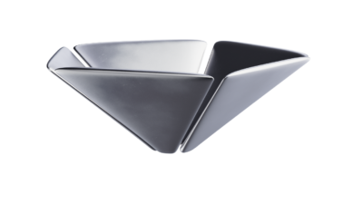
Agog flowers live alongside the Agog logo as metaphors and are central to the Agog visual-identity system. Each one represents a portal to another world, functioning as both an object and a place. The flowers symbolize a bridge between nature and technology, art and science, and fact and fantasy. They are a symbol of the nearly limitless possibilities of XR, where you can walk on water or be on an asteroid in space.
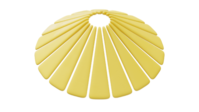
The flowers are made up of varying numbers of triangular petals, some of which are slightly rounded at the edges and arranged in a radial pattern. They can be as small as particles or larger than life and can be painted with photos or illustrations—or rendered in complex 3D textures. These forms express diversity through variation.
Materials
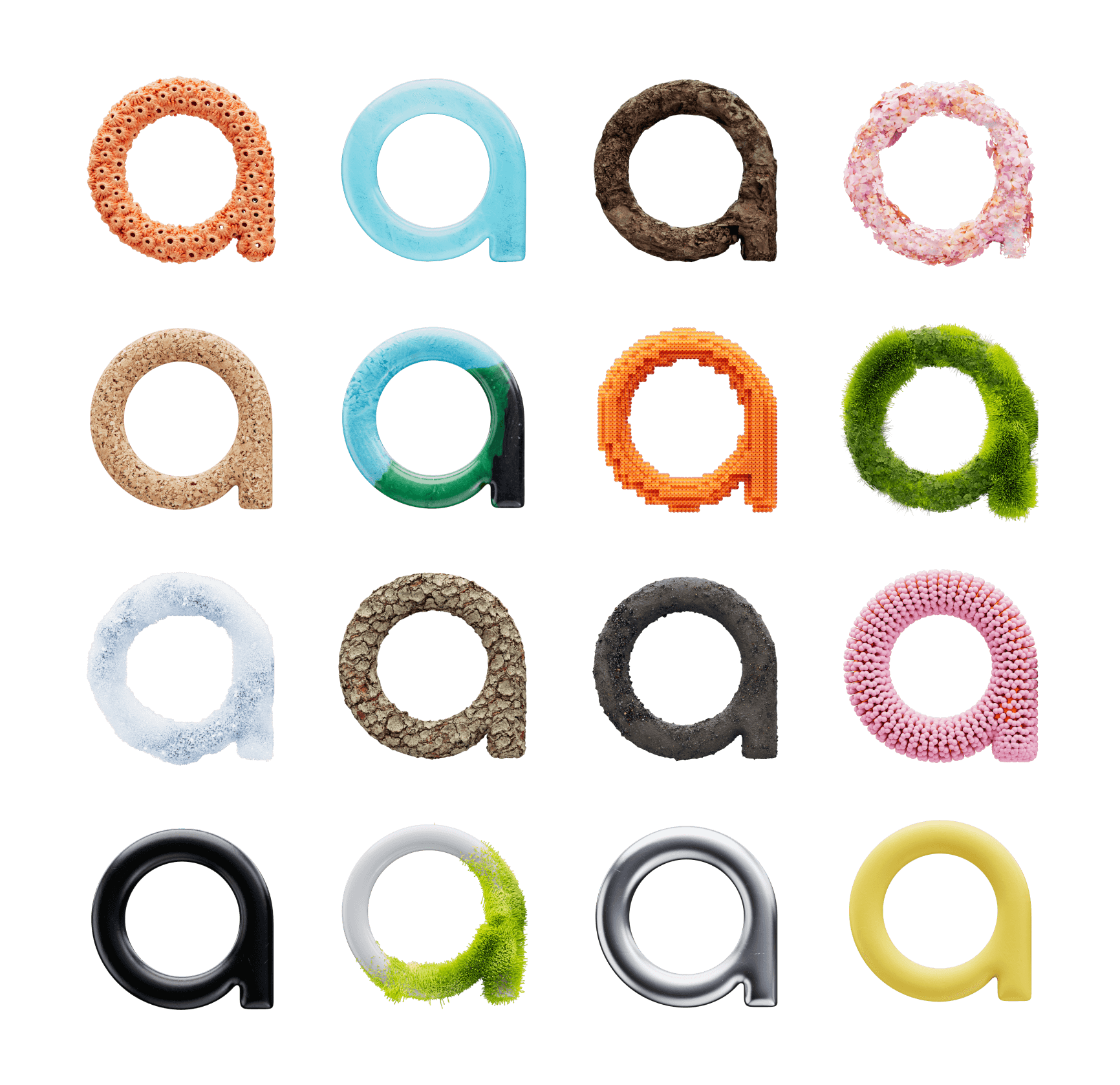
The Agog logo and flowers feature a wide range of materials that merge nature and human-constructed (but in a green way) or fantasy imagery. The materials sometimes appear organic, like moss or coral. But they can also be surprising and imagined, like a silver cocoon, a neon fractal, or a futuristic bioplastic art project. Natural and fabricated materials coexist in the world of Agog.
Although we use detailed materials with high-resolution textures for website, social media, and print applications, we prefer optimized low-resolution physically based rendering (PBR) materials for spatial applications—at least until technology advances to better support higher resolutions in the future.
For further guidance on material design and optimization, refer to the Dos and Don’ts in WebXR section.
Connecting with our audience
Even our 2D, “flat” website, agog.org, flexes spatial characteristics, such as a 3D-style flower in the hero component (implemented via Three.js) and page elements that appear to float on the page. However, users with XR-supported devices can enter a true 3D XR experience directly from the top navigation of the website.
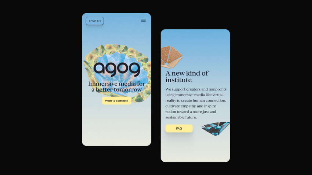
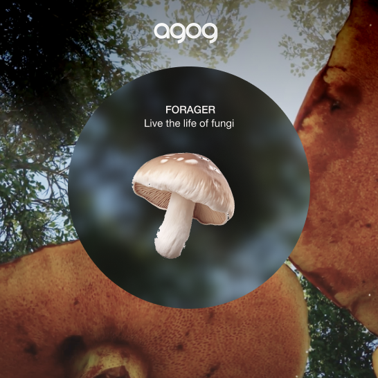
In our first version of the spatial experience, the Agog logo appears in your space, surrounded by floating Agog flowers. Each flower serves as a portal into a different world. Interacting with a flower opens an immersive layer that covers parts of your room, inviting you to enter. Upon interaction, the immersive layer grows in size, covering the room as ambient sounds start to play.
Though still in its early stages, our spatial experience shows the potential of WebXR, displaying how web content can become increasingly engaging through immersive storytelling. Even leaders in the XR field reported being excited by the possibilities of WebXR. Perhaps most important, several people have told us that they had a better understanding of Agog and a deeper connection with our work after exploring our site and XR layer. The experience represents initial strides toward making XR more mainstream.
“I rarely get excited by clicking on organization sites, but Agog really piqued my interest. The spatial layer felt like a gateway to potential, and now I want to see how we can explore WebXR with future projects. Let’s talk about how you did it!”
Barry Gene Murphy, Creative Director, Anagram Immersive
Planning for future iteration
We’re proud of our new brand, website, and spatial experience. For us, it was a practical proof of concept. However, there’s still more to be done.
Bridging gaps and improving access
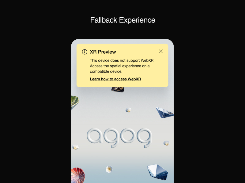
Unfortunately, accessing web-based XR is not yet as simple as opening a URL on an AR- or VR-capable device. Currently, you must click a call-to-action on the Agog website to enter the spatial layer while using a WebXR-capable device. To help close the technical divide between the 2D and XR experiences, we created a “fallback” version of the spatial layer so that users on non-XR devices, such as PCs, can explore a 3D-like experience—a simulation of how the site behaves in XR. One of our priorities is to encourage XR exploration, which is why we also invite such users to try out the XR layer on a different device, providing guidance on how to access the full 3D experience.
Motion and sound principles
At the time of our launch, Agog’s motion and sound principles were not entirely defined. Like all organizations, we had to prioritize certain parts of the project to ensure a timely launch. The motion we were able to incorporate was inspired by nature, similar to other elements of our brand. For instance, the Agog flowers open and close in a slow, organic breathing motion, and we integrated ambient sound effects into our initial WebXR layer. We’re looking forward to enhancing the experience with narration, additional motion, and haptics in the near future. Please submit your voiceover audition tapes directly to our executive director. 😉
Bookmark this guide
Spatial branding creates new possibilities for branded experiences. As part of our work, Agog wants to help nurture a growing, diverse, inclusive community of creators using XR to imagine and build a better world. By sharing our brand journey, we hope to encourage others (such as your fine self) to dive into XR. Bookmark this guide and follow us as our brand and WebXR experience continue to mature and evolve over time.
In the meantime, scroll on for even more detailed tips on XR user interactivity and accessibility tips and the dos and don’ts of WebXR. And if you have suggestions on how to make this guide more useful, please let us know.
Additional Documentation

XR user interactivity and accessibility tips
Creating user-friendly experiences in XR presents new challenges compared to traditional website design. Designers and developers must consider body ergonomics, various device capabilities, and numerous technical limitations. Here, we gather user experience (UX) learnings—from scene design to user interaction to placement of AR scenes into a user’s physical environment.
Use spatial playgrounds to inform design
UX in XR is more complex than in traditional media. What seems effective on a desktop screen or on mobile may feel entirely different in an XR device, and vice versa. Designing in XR is not yet frictionless, so it’s important to prototype and experience objects and interactions with an XR headset early on. In XR, designers must consider whether a person is standing, walking, sitting, or lying down. They need to account for body ergonomics, as well as movements of the head and hands, and determine whether XR content stays fixed or dynamically moves with the user. The human field of view (FOV), depth, and body measurements are also key considerations in creating XR scenes optimized for human interaction. In Agog’s spatial design process, we established spatial playgrounds. This step involved importing diverse shapes, sizes, materials, and environments into one place so that the team could experience them inside XR, a process that enabled us to make informed design decisions based on actual spatial experience, rather than relying solely on visual intuition.
Try this WebXR prototype with a VR headset. You can use hmd.link or the Meta Quest app to copy the link directly to your headset.
Design for all devices and users
Users can engage with XR scenes in various ways, including using controllers, hand tracking on headsets, and touch on mobile-phone AR experiences. Headset users with controllers can receive immediate responses to their actions through haptic feedback, which simulates the sense of touch via vibrations. In contrast, users relying on hand gestures cannot experience such tactile feedback. Providing clear visual cues when users hover over and select content become crucial for those relying on hand gestures. In contrast to either controller or hand-gesture headset users, mobile users lack access to hover states altogether, relying solely on touch events in their XR experiences. Eye tracking provides yet another way for users to engage in XR experiences. While eye-tracking technology is not yet widespread, it is expected to grow significantly in the coming years and will enable enhanced user interactions. For more insights, watch Apple’s WWDC23 video about designing for spatial input. Many of the suggestions in it can be applied beyond visionOS.
Plan for space detection in AR
Successful XR experiences require placing objects at comfortable distances and, in the case of AR, avoiding odd intersections with real elements in the physical environment. AR detection can help with this second challenge, but its usefulness varies depending on the capabilities of different devices. Generally, newer smartphones and dedicated AR devices are equipped with sensors and software that enable them to detect and understand the surrounding physical space. More basic smartphones offer only rudimentary surface detection for placing virtual objects. Mid-range devices equipped with depth-sensing cameras or LiDAR sensors can provide more accurate depth information and detect object geometry and walls. Most WebXR devices can perform a hit test to determine how to place an object correctly on a flat surface in the real-world physical environment. While these hit tests are useful, it is important to consider fallbacks for devices that can’t use them and need manual room mapping. Read more about hit tests here.
WebXR Dos 👍 and Don’ts 👎
In this section, we condense what we learned from working on our WebXR project into a list of dos and don’ts. Whether you’re new to XR or an experienced designer or developer, adhering to these principles will assist you in launching a successful, immersive UX using WebXR.
Consider performance in everything you do
It is tempting to craft a scene with high-resolution textures, very detailed geometry and models, and realistic lighting typically used for creating still images or pre-rendered video, and then pass it along for implementation. Don’t! It’s crucial to test whether your scene renders and performs well in real time on the web and on XR devices early in your design process. Low device performance and image resolution are the two main constraints that designers and developers currently face with WebXR. Although XR headsets tethered to high-powered gaming PCs see performance benefits, standalone headsets often perform no better than mobile phones. To ensure a comfortable user experience, we found it best to create scenes that render well on mobile.
3D modeling: Simplify geometries
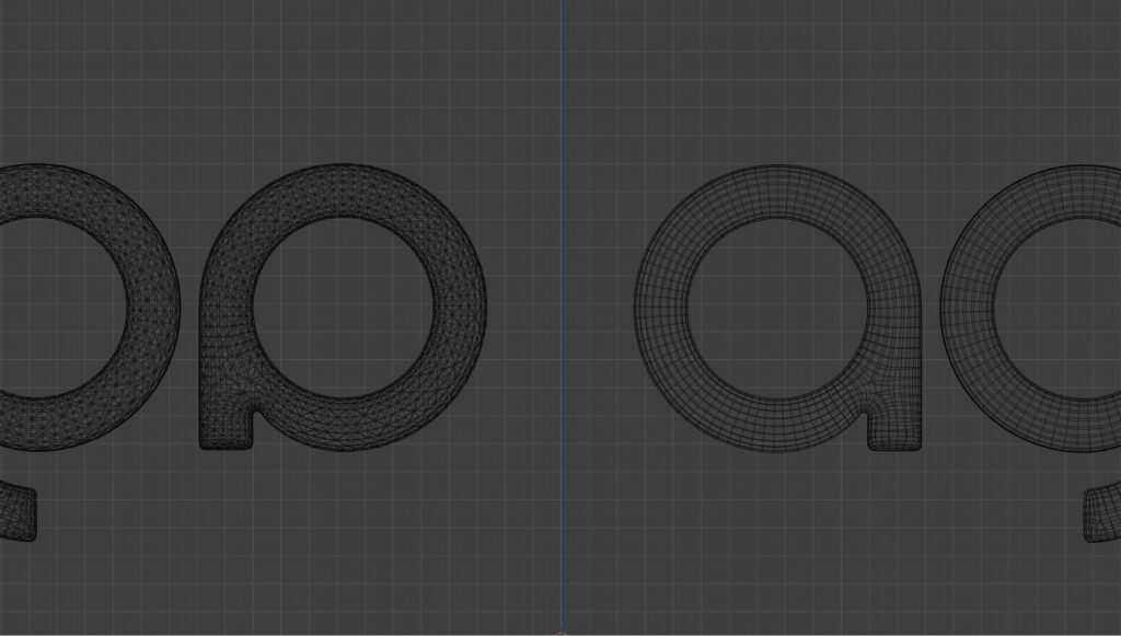
- Keep vertex counts low: Minimizing the number of vertices decreases memory usage and rendering costs. This methodology is particularly important in WebXR experiences, where a low poly style is often preferred for smoother performance.
- Minimize draw calls: A draw call tells the device’s graphics API what to draw and how to draw it—i.e., what appears in view. Every mesh in your scene adds to the number of draw calls required, which can overwhelm low-performance devices. Reduce the complexity of your scene to limit the number of draw calls and optimize performance.
- Avoid intricate details: Consider using textures to create the illusion of detail instead of relying on intricate geometry. Techniques like normal mapping in physically based rendering (PBR) materials allow you to add surface detail without increasing vertex counts, improving performance on various devices.
Materials: Optimize for performance
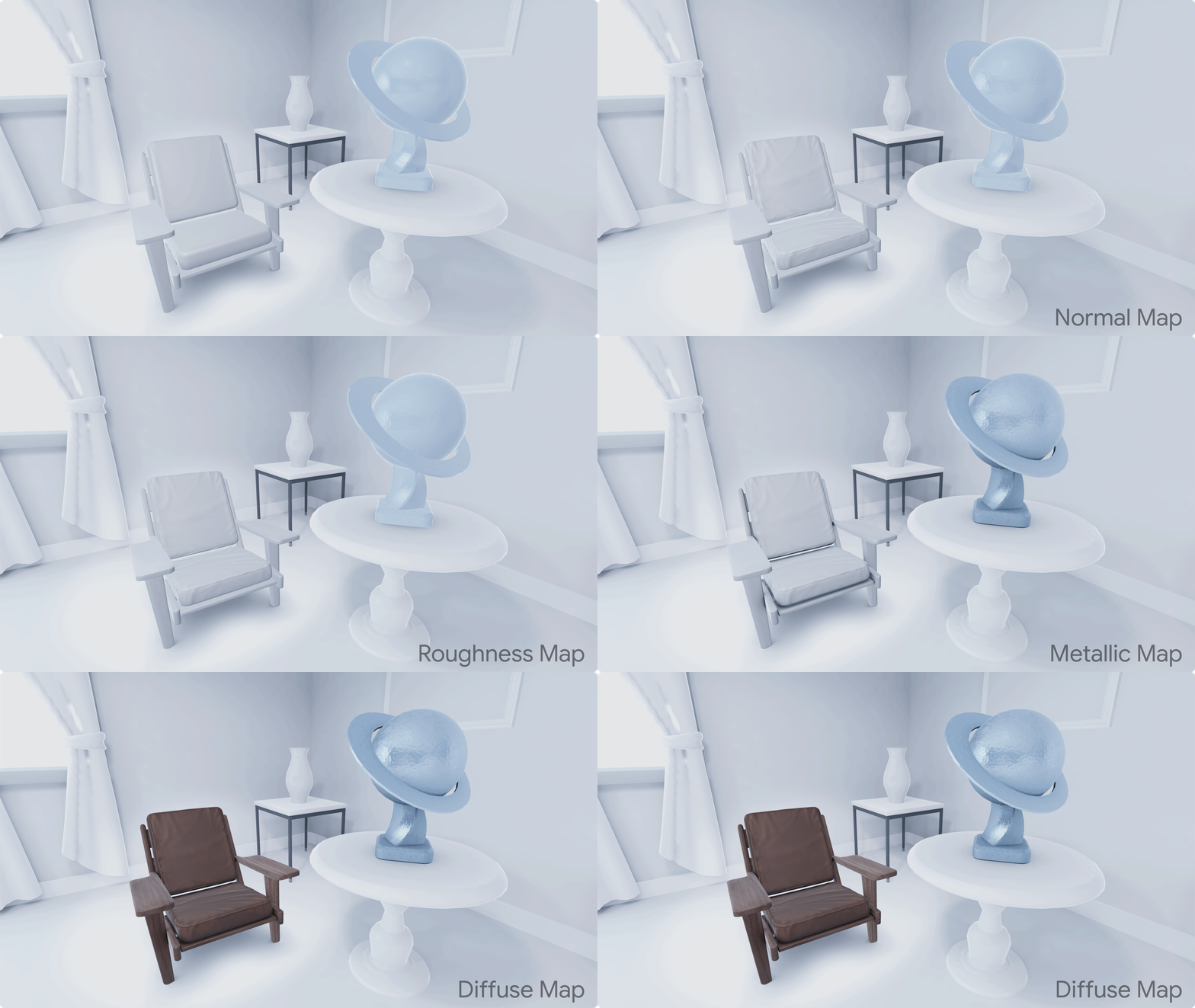
- Opt for PBR materials: In AR, materials need to react to a dynamic environment that changes in real-time. Well-crafted PBR materials offer more realistic scenes under various lighting conditions and better performance. This adaptability ensures a more immersive experience for all users.
- Exaggerate materials: Incorporate multiple textures and roughness levels to make objects look more interesting. Adjust texture intensity and size to compensate for lower resolutions in XR headsets.
- Test materials early in your headset: Materials look very different on a computer screen from how they do in a headset, so make sure you view them with the right device as soon and as often as possible. You can tweak textures directly inside XR by extracting all material properties onto a debug panel within your WebXR prototype. If you don’t have access to code, you can also use tools like Spline or Bezi, or export your 3D files as glTF files and add them into a WebXR scene.
- Leverage shader materials: If possible, develop shader materials directly in code to animate textures and introduce motion into the scene. This dynamic approach adds depth and engagement to the XR experience.
Lighting: Understand image-based lighting
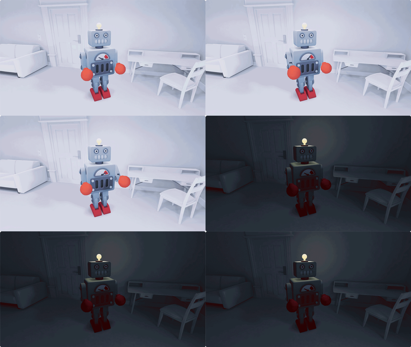
- Optimize image-based lighting (IBL): A realistic and performant way to add depth to a scene is to pre-calculate lighting information and store it in textures. The most important IBL technique is environment mapping, also known as reflection mapping.
- Use high dynamic-range images (HDRI): An HDRI image has a much higher dynamic range than a normal JPEG image. It contains multiple exposures that include many more details in dark and bright areas.
- Explore WebXR lighting estimations: Some WebXR devices already provide light estimations for realistic lighting based on the user’s environment. However, this ability depends on the device and won’t work in all cases. For further insights, explore these resources.
Typography: Test legibility

- Use simple fonts: Avoid typefaces that are too thin, condensed, or too highly contrasted serifs. Simple fonts work better in these low-resolution environments.
- Anticipate angles: When viewed in XR, text might display on an angle or move with the headset as the user interacts with the scene.
- Place type within the human field of view (FOV): Stay true to real-life distances and scale, and keep copy short overall. Consider voice and narration as an alternative to text.
Read more on Google Fonts’ documentation on “Using type in AR & VR.”
Colors: Avoid pure black and white
- Opt for softer alternatives: Pure black and white don’t exist in nature and present problems in many applications. XR is no exception to this rule. For example, the Hex code for pure black (#000000) defaults as transparent for some AR devices.
Appendix: Resources and Links
Collected resources:
- Brand guidelines library
https://brandingstyleguides.com/ - Design for spatial input
https://developer.apple.com/videos/play/wwdc2023/10073/?time=741 - Hit test
https://developers.google.com/ar/develop/hit-test - Lighting estimation (W3)
https://www.w3.org/TR/webxr-lighting-estimation-1/ - Lighting estimation (Three.js)
https://threejs.org/docs/#examples/en/webxr/XREstimatedLight - Meta design
https://design.facebook.com/stories/designing-our-new-company-brand-meta/ - Apple – Build Immersive Web Experiences
- https://developer.apple.com/videos/play/wwdc2024/10066
- Pluto XR brand case study
https://www.14islands.com/work/pluto - Progressive Web XR
https://blog.mozvr.com/progressive-webxr-ar-store/ - Realism in AR (PBR materials)
https://developers.google.com/ar/design/content/realism - Transitioning from 2D to 3D
https://www.14islands.com/journal/using-the-jaws-effect-to-transition-between-2d-and-3d - Typography in AR and VR
https://fonts.google.com/knowledge/using_type_in_ar_and_vr
Tools
- Babylon.js
https://www.babylonjs.com/ - Bezi
https://www.bezi.com/ - Bezi human body rig tutorial
https://www.youtube.com/watch?v=tx1Airjm9Pg - CodeSandbox
https://codesandbox.io/ - Microsoft Maquette
https://apps.microsoft.com/detail/9ngd2snl8z4w?hl=en-US&gl=US - React XR
https://github.com/pmndrs/react-xr - ShapesXR
https://www.shapesxr.com/ - Spline
https://spline.design/ - Three.js
https://threejs.org/ - Unity WebXR Exporter
https://assetstore.unity.com/packages/tools/integration/webxr-exporter-109152 - Wonderland Engine
https://wonderlandengine.com/
Special thanks
- Upstatement
https://upstatement.com/ - 14islands
https://www.14islands.com/ - Joseph Töreki
https://www.darkdragonlord.de/
